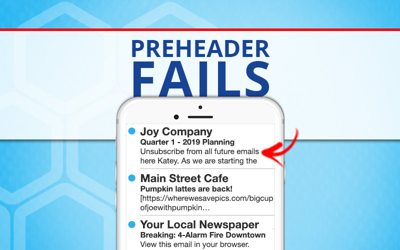
Warning … email marketing rant follows.
Seriously. This subject line/preheader combo just landed in my inbox:
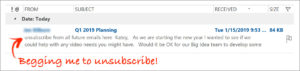
Granted, it’s an unsolicited email, so I’m glad they offer me the opportunity to opt out before I even open the email, but did they bother to look at a test before sending this out?
This is a fantastic example of what happens when you don’t customize the content of your preheader: Your ESP’s default preheader becomes the main call to action. Yikes!
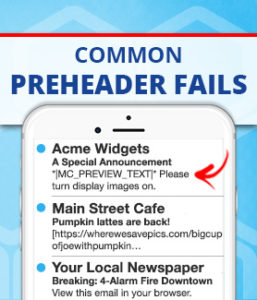 Here are a couple of other preheader fails we all see a lot:
- The failed personalization field.
- The path to where your logo or hero image is hosted.
- The “view this in your browser” request. (Anyone tired of this one?)
If this is what a bad preheader looks like, what does a good preheader look like and why is it important?
Your preheader is important because, combined with your from address and your subject line, it will determine whether or not your email gets opened.
For you journalism types, think of your subject line + preheader text as your headline + deck. They should complement each other and be designed to entice your subscriber to keep reading. Study your inbox for a minute and you’ll quickly see what I mean.
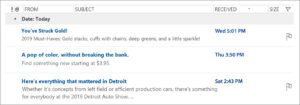
Here are a few examples of effective preheaders from my own inbox:
If you need help boosting your open rates, send Katey Charles Communications a note at . We are happy to help optimize your email copy!